Website Design Projects

Frameworks Employed
Responsive Website Design (RWD)
Can not stress enough the importance of this paradigm. Not having your site designed as responsive is akin to still using Windows 95. It might just still about run certain applications but at what cost - security, productivity, connectivity, efficiency and the list goes on and on. The aforementioned notwithstanding,smart-phones so omnipresent is a very compelling reason to implement RWD.
You do not want to miss out on the millions accessing the internet through this device. The desktop or laptop are no more the default gateway to the web. RWD incorporates functionalities that ensure consistent user experience irrespective of their device type when viewing and interacting with website content.
Client Main Objectives
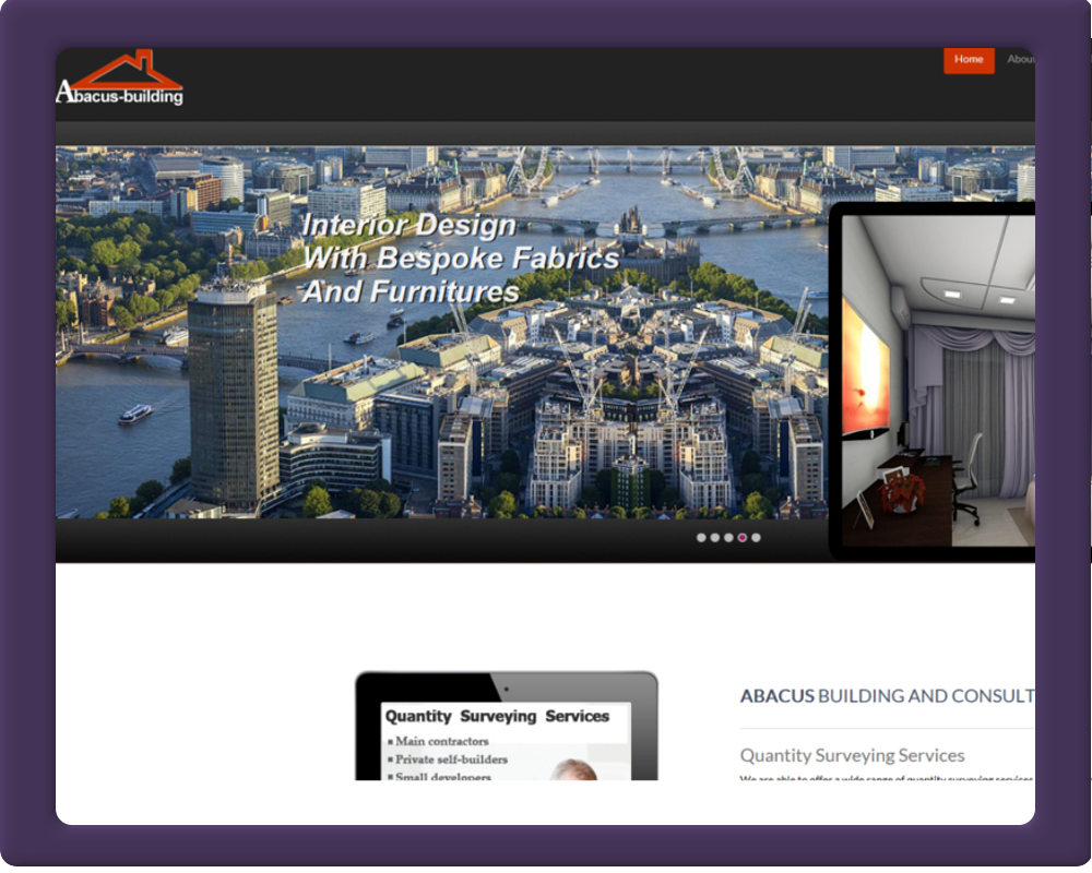
Being a site that heavily relies on the expertise of a highly qualified professional,our main objective was to emphasis this salient future on the design interface and make it as minimal as possible. One way is to infuse graphics within the interface that have some contextual affinity or connection with the profession in question. Thus, in this design we went for architectural drawings to bring these objectives into the interface - the client is a "Freelance Quantity Surveyor".
You will see the use of "parallaxing" utilized a lot. I hear you ask what the heck is this - it is a web design trend that refuses to go away (parallax scrolling). With this, the website layout sees the background image of the web page moving at a slower rate than those in the foreground. And all these is control through javascripts and CSS.
CSS and javascript provided intuitive and interactive frontend interactions. The backend is powered by php with a functionality to send bespoke crafted branded responsive emails to contacts and prospective customers
-
Major Software Tools:
Adobe - Photoshop_cc and Dreamweaver_cc -
Price:
£550 -
Duration:
2-Weeks - 50 man hours
-
-
-
Total No Of Pages
- HTML5
- 10
- PHP
- 5
- JavaScript
- 5
- CSS
- 4
Total No Of Graphic Assets
- Jpeg
- 30
- PNG
- 20
- Gif
- 10
- SVG
- 4