Contact Form
Please make sure all fields are filled
More and more people are now accessing the Web on their smartphone and tablet devices than a desktop computer. In fact, already a
significant number of people use their smartphones as their only access to the Internet. Thus, it is important for designers and developers to
understand how to deal with this entire mobile world.
Although, we haven’t entirely figured out how to make all the content we are familiar with seeing at our desk provide an equally pleasing experience
on our handheld devices, the technologies and tools for doing that are eviolving and getting better.
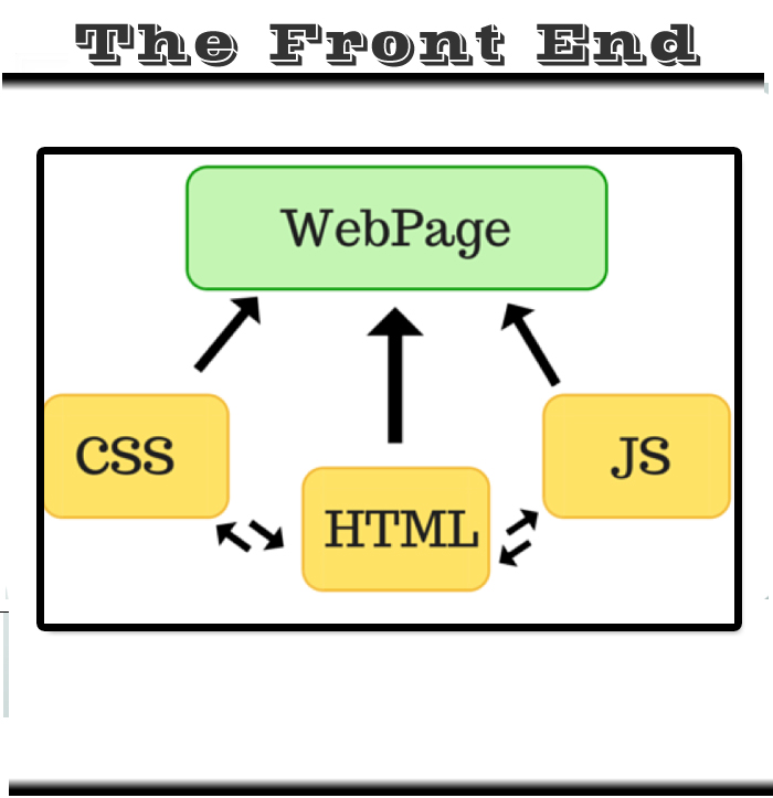
A front-end web development framework is simply a collection of production ready HTML/CSS/JavaScript components that we can use in your designs.
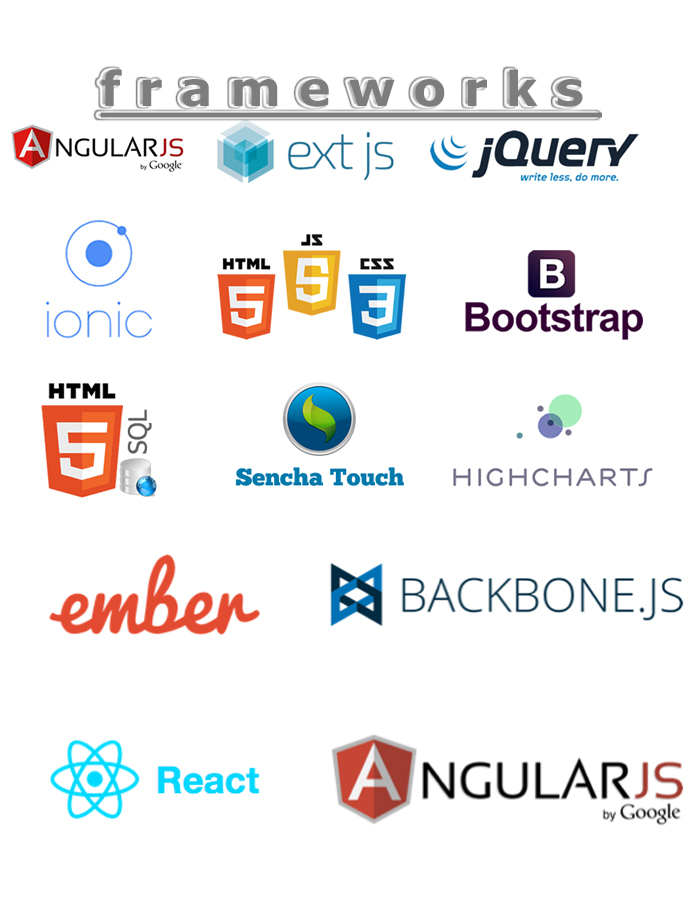
There are many frameworks out there but some of them stand out from the crowd. For your facilitation below you will find outlined some of the
most powerful and popular frameworks available today. Bear in mind that these are not just CSS grids or so, but instead full-featured front-end
development frameworks
One of the primary strategies we use when we deal with unknown viewport size is the so-called responsive web design. It’s a mechanism for
providing custom layouts to devices based on the size of the browser window. By default, most browsers on small devices such as smartphones
and tablets shrink a web page down to fit the screen and provide ways for zooming and moving around the page. Although it technically works,
it is not such a great experience. The text is too small to read, the links too small to tap, and all that zooming and panning around is more or less
distracting.
The technique of responsive web design is to serve a single HTML document to all devices by applying different style sheets based on the screen
size in order to provide the most optimized layout for that device. For example, when the page is viewed on a large desktop browser, the content
can be placed into multiple columns with normal navigation elements. But when that same page is viewed on a small smartphone screen,
it appears in one column with large links for easy tapping. To see how it works, - just maximize your browser and then resize the window
progressively both width and
height respectively, and see as the layout changes based on the window size.
Responsive web design is an ingenious solution for dealing with the ever growing myriad of device types. But what are
the actual tools and technologies to implement it in designs and developemt? Do we have to be web gurus to handle it or will the essential
skills we already have be enough? Are there any tools that can help us?
This is where a very popular front-end development framework comes into play - Bootstrap. Responsive web design is not so hard to implement
when you use this brilliant kit - can sometimes be a little bit tricky
In the main, it allows you to create responsive, standard-compliant websites
with minimum effort while at the same time keeping everything simple and consistent. Frameworks give you a lot of benefits such as speed and
simplicity, consistency across different devices, and much more. One of the most important advantages is that they are so easy to use that even
a person with minimal knowledge can utilize them without any problem.
To sum up, if you are serious in today’s web development then using this frontend framework (arguable, there are others too) is a must and not an option. Nowadays your site must be
extremely flexible in order to satisfy different browsers, tablets, smartphones and a whole bunch of other handheld devices.
Bootstrap is definitely the most popular and widely used framework, nowadays. It’s a beautiful, intuitive and powerful web design kit for creating cross browser, consistent and good looking interfaces. It offers many of the popular UI components with a plain-yet-elegant style, a grid system and JavaScript plugins for common scenarios.
Bootstrap is already powerful enough to empower any web interface. But in order to make more use of it and making the development process easier, you can find plenty of tools and resources that complement it. Some of them are listed below:
This is a good collection of design elements and HTML snippets for Bootstrap. It offers also form and button builders.
LayoutIt – drag and drop interface builder based on the elements and components of Bootstrap.
It helps you to compose your design visually by placing and arranging different elements into your layout via drag and drop and then allows you to edit their properties.
You get the base code and then expand it. Simple and easy.
Fbootstrapp is based on Bootstrap and gives you the same functionality for Facebook iframe apps and designs. It includes base CSS and HTML for all standard components like typography, forms, buttons, tables, grids, navigation, and more, styled in the typical Facebook look and feel.
BootMetro is a framework inspired by the Metro UI CSS, which is built on top of Bootstrap, for creating Metro/Windows 8-styled websites. It includes all Bootstrap’s features plus some additional extras like tiled pages, an application bar, and more.
Simply put, Kickstrap is a kind of Bootstrap on steroids. It uses Bootstrap as its base and extends it with many apps, themes and extras. This makes the framework a complete kit for building websites without the need to install anything. Just put it in your site and you are ready to go.


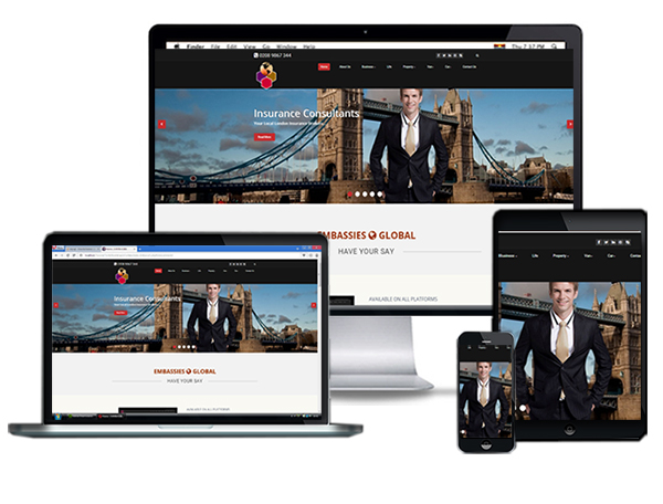
Employing Responsive Design Enables Consistent Viewing On All Platforms :
Desktop - Tablets - Smartphones.
One of the fundamental changes that has happened recently with regrads to how data is consumed from the internet is - Responsive Web Design.
You do not have to be a so called techy to appreciate how relevant this is - you the consumer can view this website whith any device at your disposal with the same consistent user experience
The technology fundamentaly looks at your device ( Tv, desktop, laptop, tablet , smartphone) ascertain whtat it is - then transparently renders the content to match your device type. All these happen in the background.
Now your site gets rated highly if it implements Responsive Web Design (RWD) and relegated if it does not by the tech giant Google. For website owners and stakeholders it is no more an incentive but a necessity . And all these has come about as a result of the extra ordinary expansion and usage of smartphone and tablet devices- read more here.
We are more that happy to get the process rolling if you feel the urge to emback on an RWD project - revamping your existing site or may be a new one . Whatever the reason, do contact us using the contact form. Here is more stuff to digest on the matter Readmore here
Here is a listing of the most commonest expertise we have attained for over ten years
we pride our services with diligence, professionalism and expertise when it comes to development and deployment
Desktop - Tablet - Smartphone
Technological advances continue to break down barriers to creativity In movie creation. Bulky large film cameras have given way to smaller,
more portable equipment. Film transitioned into analog videotape, which is now digital video. Professional features made their way into consumer
units and then onto smartphones. Do have another look now - you’ve got a movie studio in your pocket.
Audio and more importantly video used to be the preserved of the big conglomerates on the web. With the proliferation of smartphones and the wide spread
of affordable high speed broadband, you too can make much use of these resources to enrich your content. It is often said a picture is worth a thousand word.
It makes you wonder what a combo of audio and video is worth - a billion or more ?. The latest HTML5 and CSS3 directives respectively, has afforded designers and developers a far more greater scope in implementing these resources on to websites.
when captured in a variety of resolutions .Every standard smartphone can now capture video in high definition.
The only problem you have got now is to judge what to capture - because the possibilities are mind boggling.
You don't have to worry about how the resource (video/audio) is implemented on the site we will take care of that . As mention earlier, the are host of new functionalities in the developper's toolbox to experiment with so as to deliver the best experience in consuming these resources.
This page has a sample video clip on the left. It currently shows just one video but functionalies could be added that will enable the selection from a list of categories just like in a photo gallery.
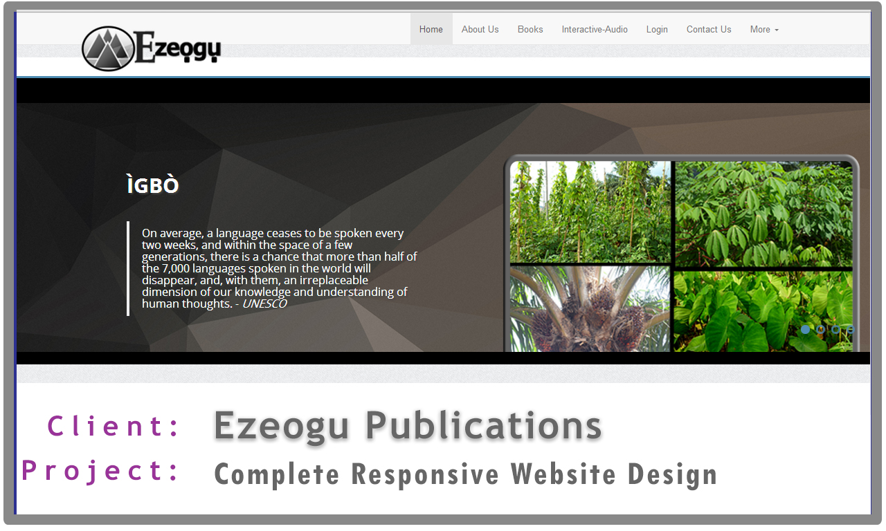
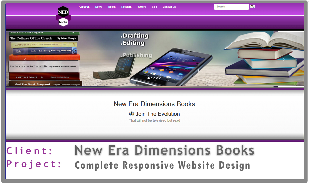
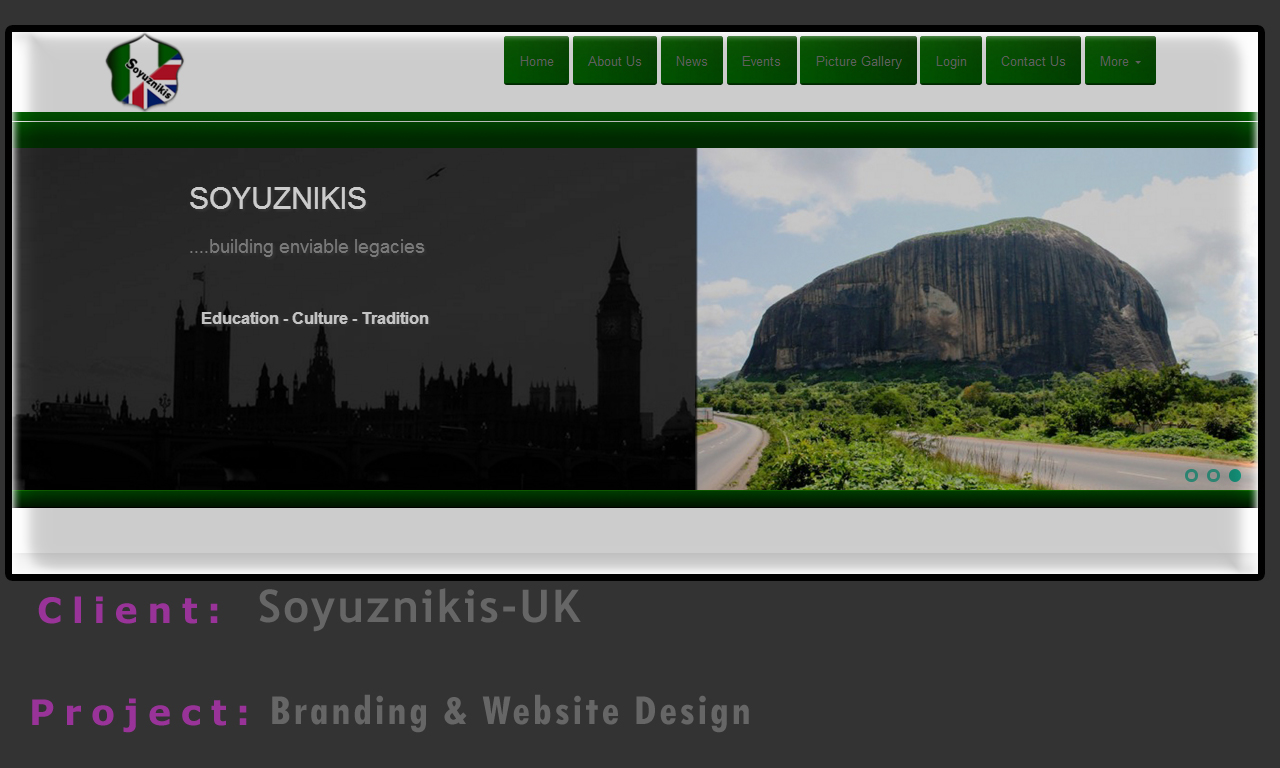
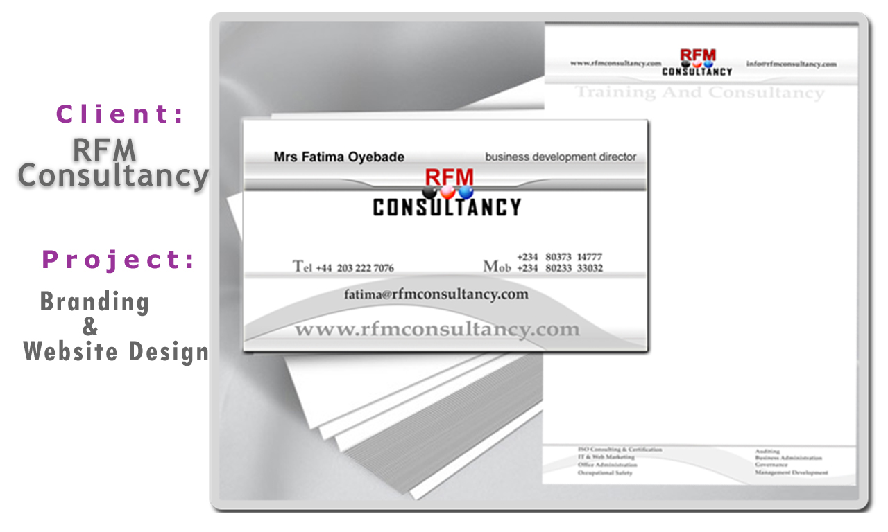
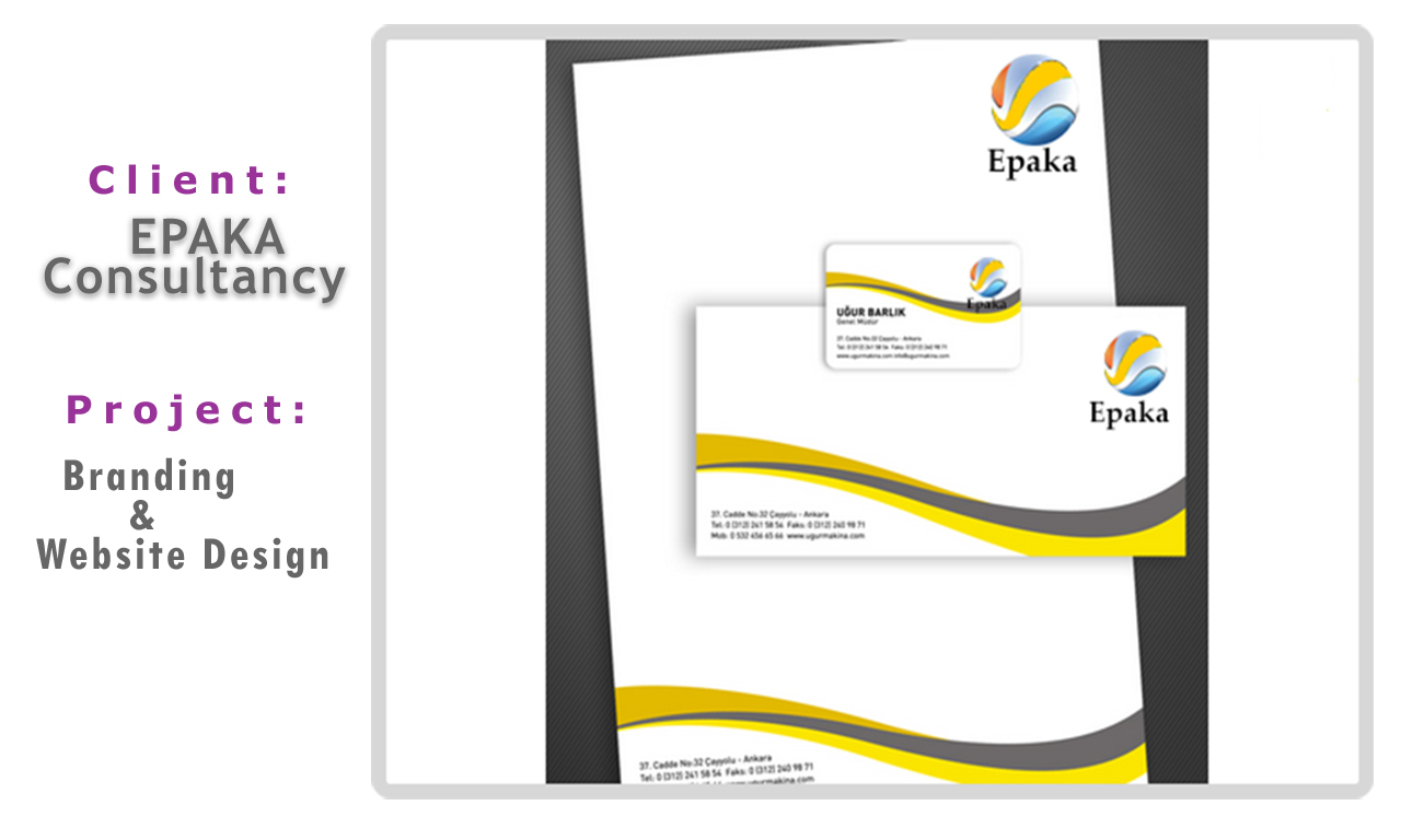
Here are samples of some projects we have been involved in lately. Feel free to peruse and comment - magnifier large image and link project details


As professional developers and designers it is essential to be abreast with all the latest standards, specifications
and documentations with regards to programming,design and implementations. We have a small but relevent web resources we constantly review
so as to be at the top of our game
Here is a sample list


We hope what you have read and seen has provided you with some basic understanding of what we do here.
And we are also aware that it might have also given you some food for thought or encourage you to enquire about
other stuff that has now become apparent or clarified. Whatever it is just click the ContacfForm button below - submit the form as required.
We will respond asap to all your enquiries.
ContactForm